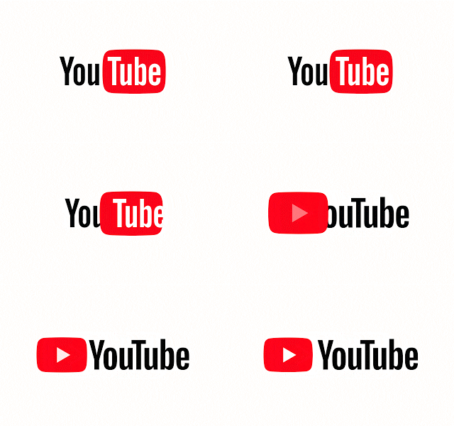
Twelve years after its birth, the most widely used and giant video platform YouTube just unveils a new logo, new interface, and new features. In this way, the streaming video platform par excellence gives a facelift to its image, adapting its appearance to the contents and uses of the new times.
When YouTube came on the scene, it was the only portal that supported videos in 320×240 format with a 4:3 aspect ratio. Extensions of supported resolutions, mobile applications or the jump to consoles and Smart TVs would come later, and the platform currently offers SD, HD, 4K, 360 and 3D video on virtually all devices with the Internet connection.
To celebrate its twelfth anniversary, YouTube has already presented a major redesign of its desktop website in the middle of this year. This change offered a cleaner look, with a more fluid navigation and the incorporation of a dark way to navigate the videos with more comfort during the night. Now, this new design which is based on Material Design is available to all users.
Now, this image was also extended to the YouTube logo, which except slight color variations had not changed in these twelve years. The change is not very drastic, so if you have entered the last hours in the service it is possible that you have not noticed that it has been updated. Below you can see the previous logo compared to the current logo.
New features have also hit the YouTube mobile app. Now the mobile app also has a cleaner and easier to use design, with the navigation tabs at the bottom to be closer to the thumbs. They will also incorporate new gesture controls to jump from one video to another with a flick, options to speed up and slow playback or a new row of suggested videos that appear with full-screen playback.


No comments:
Post a Comment